Figure A
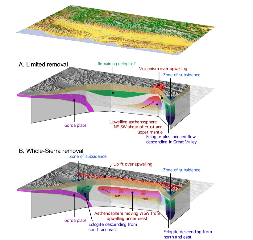
Two views of Sierran geodynamics (a) eclogite and lithosphere only removed in the Kings-San Joaquin area and (b) eclogite and lithosphere removed from nearly the full length of the Sierra.
Figure B
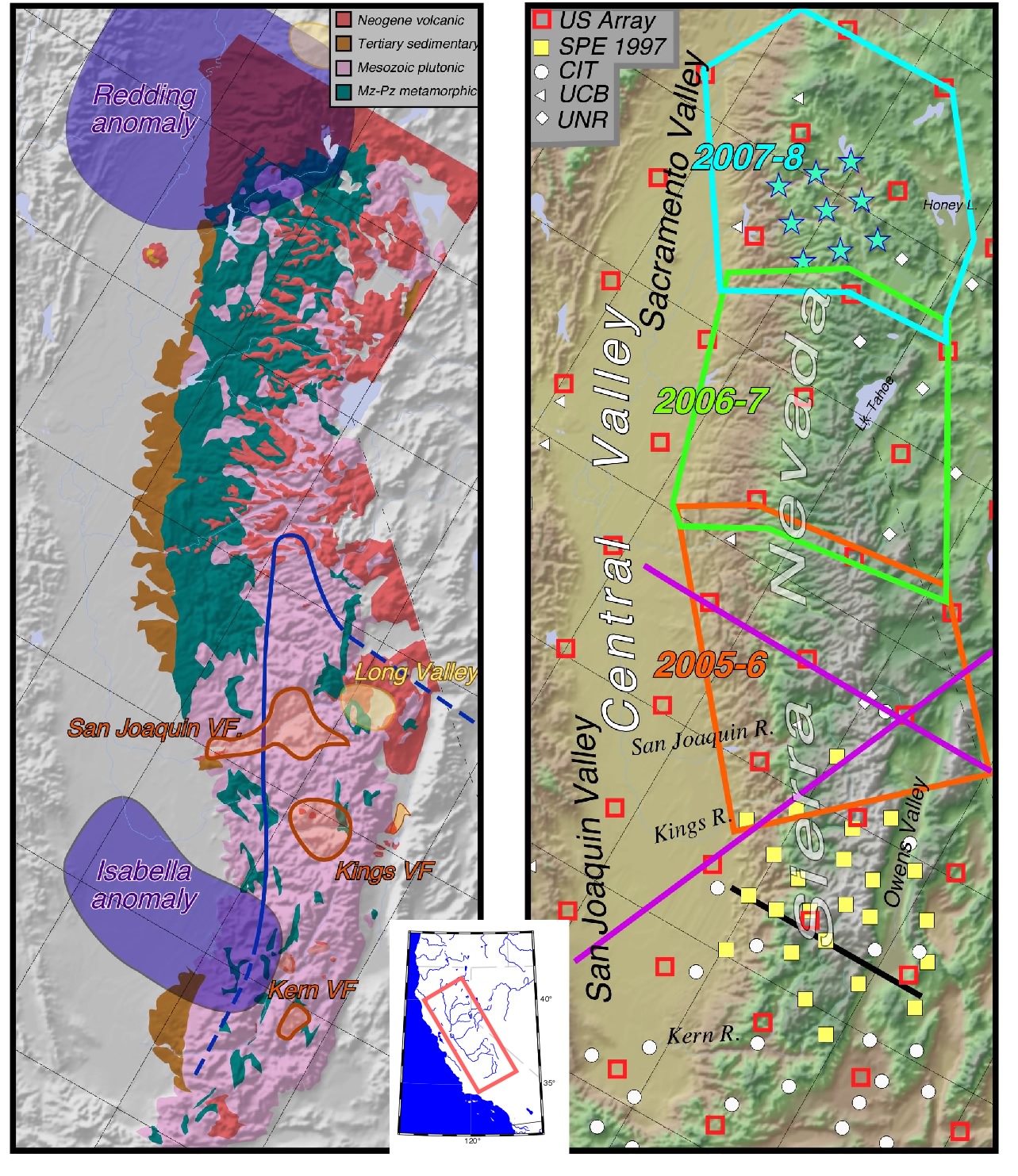
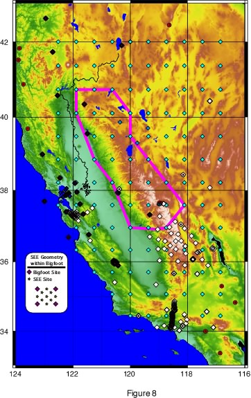
Figure B, take 1 (Oblique version). Left panel: Simplified geology of the Sierra, with Neogene volcanic fields in the southern Sierra as indicate in orange outline. 87Sr/86Sr = 0.7060 line in blue. High P-speed anomalies in purple. Note the north to south changes in the width of the Cenozoic sedimentary rocks on the west flank of the Sierra, and the extensive volcanic cover in the northern Sierra. Right panel: Existing, prior, and proposed broadband seismometers on shaded elevation. Colored boxes outline sequential deployments proposed, with stars showing a representative deployment in one area. MT profiles in purple. Black line shows profile of Figure D. Click on figure for a bigger version (515 kb).
Figure "D"
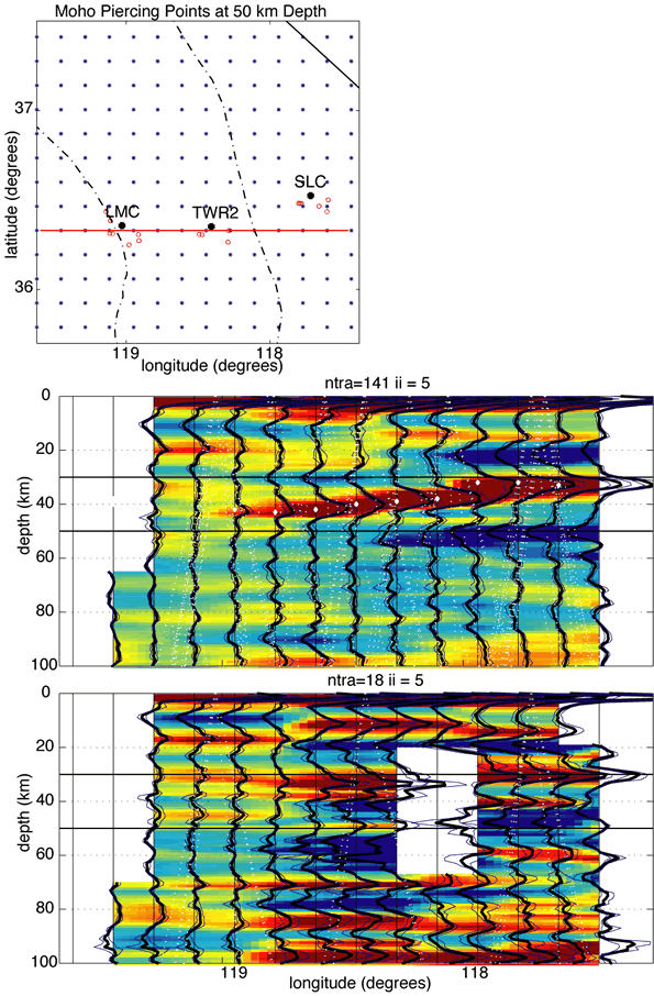
This is Hersh's figure of a cross section in the southern Sierra of the receiver functions, red being positive conversion of higher under lower velocity material (e.g., Moho at 35-40 km in top) and blue (like MCN conversion, 22 km in top) being low under high. Top panel is map of this (we'd probably drop and put section on Fig. B), second is the SPE data, third is SPE downsampled to the US Array spacing, showing how the greater density from this experiment is a huge help. This also illustrates the dim Moho problem in the Sierra foothills and the west dip on the Moho.
Figure D-Alternate
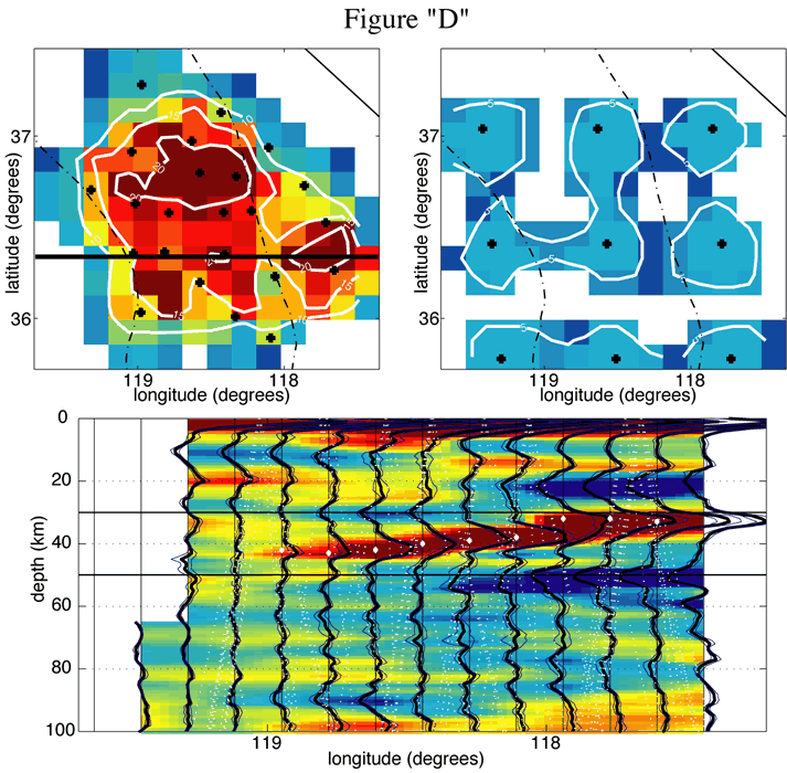
Alternate Fig. D. Top panels show the hit count (in counts/15 km2 bin) for SPE deployment (left) and US Array for same events (right). Bottom panel shows a receiver function common conversion point stack along the solid line in upper left panel. Note the Moho dipping to the west (marked with white dots) and losing amplitude near the Isabella anomaly, the blue mid-crustal negative conversion above it thought to represent a major shear zone, and a low-velocity zone~50 km depth in the upper mantle under the eastern Sierra and western Basin and Range.
Figure MT 1
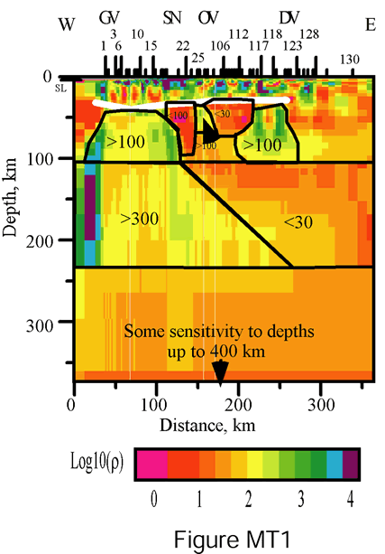
Figure MT2
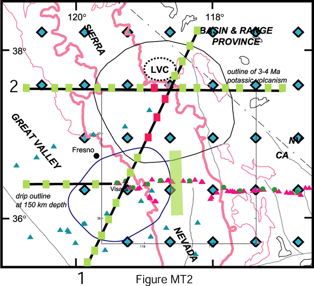
MT location map. Certainly will be combined with Fig. B.
Figure B Projection Comparison
On the left (or top, depending on window width), an Oblique Mercator Projection of the Sierra, on the right the same part of the Sierra in a Mercator Projection. Which should we use?
Station Map
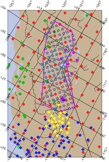
Stations on the oblique Mercator. Colored stars are approximate locations of the proposed BB deployment, open stars are ones close enough to permanent station that we would rely on the permanent station. Colors by year (orange, blue, then green) with stations at the edge being retained for the following year to help in merging results. Two blue "L"s are sites for initial short period arrays. SPE in yellow, Bigfoot in red, Trinet in blue, UCB in green, UNR in pink. This ugly thing more for reference at the moment.
Station map from U of A initial document, Mercator projection. Note the Bigfoot stations here are somewhat off from figure above (fig. above on obliquye mercator used the available proposed site locations).
Geology Map
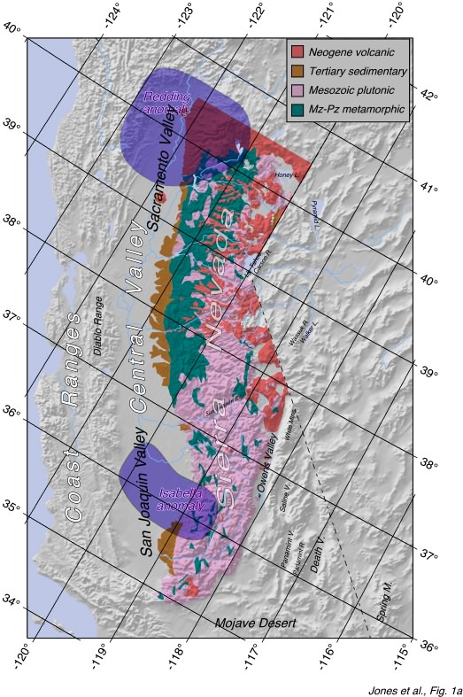
This is one overlay I have in my collection that might be handy--simplified geologic map of the Sierra stolen from Waka. and Sawyer. in case it looks useful (it shows the extent of volcanics to the north, the change in the percentage of wallrocks in the Sierra to the N, and the variations in the exposure of the T section on the west flank).